Tim Ellis’ Data Portfolio
Ready to hire me? Drop me a line at: tim@ellis.fyi
Following are a selection of data analysis and data visualization works by Tim Ellis, produced both professionally and as a hobby.
- Redfin: Income Gains and Rent Increases Follow Rail Transit
- Redfin: A Picture is Worth a Thousand Dollars
- Redfin: Sustainability vs. Affordability
- Redfin: Weekly Housing Market Reports
- Porch: Air conditioning and the rise of the south
- GeekWire: Where should Amazon build HQ2?
- GeekWire: Tech News… “Quietly”
- Seattle Bubble: Seattle Housing Market Analysis
- Rover: Dog breeds & names vs. political affiliation
- Personal: Everett to Seattle Traffic Is Blowing Up
- Personal: Can Seattle Support Six Major Pro Sports Teams?
- Personal: How Much Paint Would it Take to “Cover the Earth”?
Redfin: Income Gains and Rent Increases Follow Rail Transit
An in-depth look at how the introduction of rail transit impacted neighborhoods around the stations in three cities: Atlanta, Los Angeles, and Seattle.
View the original report on the web, or download the pdf here.
Sample visualization:

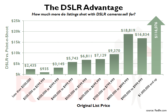
Redfin: A Picture is Worth a Thousand Dollars
For this project I wrote a Python script that ran on our image server and extracted the EXIF data from over 100,000 home listing photos, then joined that data with listing data in our database to analyze the impact of shooting a home’s photos with a DSLR camera.
View the original report on the web, or download the pdf here.
Sample visualization:
Redfin: Sustainability vs. Affordability
In this analysis I looked at the relationship between home prices and “sustainability,” as measured by parks, walkability, transit, and bike-friendliness.
View the original report on the web, or download the pdf here.
Sample visualization:

Redfin: Weekly Housing Market Reports
While at Redfin, I produced a weekly update on the housing market, with a series of charts that were automatically updated in Tableau, shared as static visuals in the report. This report was dynamic, adding various views on the data as they became interesting or relevant, for example when the monthly homebuyer mortgage payment began to soar, I added a chart for that (sample below).
View an example of one of these reports on the web, or download the pdf here.
Sample visualization:

Porch: Air conditioning and the rise of the south
In this analysis I compared the growth of air conditioning to the share of the US population that lives in the south.
View the original report on the web, or download the pdf here.
Sample visualization:

GeekWire: Where should Amazon build HQ2?
This analysis for the tech news site GeekWire used a large variety of factors to rank various metro areas in the US and Canada to determine which one best fit Amazon’s stated criteria for HQ2.
View the original report on the web, or download the pdf here.
Sample visualization:

GeekWire: Tech News… “Quietly”
This was a bit of a light-hearted analysis I posted on GeekWire that used Twitter data to determine which tech news sites were most guilty of over-using the cliché term “quietly” in their headlines.
View the original report on the web, or download the pdf here.
Sample visualization:

Seattle Bubble: Seattle Housing Market Analysis
Since 2005 I have been posting analyses of the Seattle housing market on my website SeattleBubble.com. Here are a couple of samples of my work from there.
March 2022: So… what the heck is going on with the Seattle housing market?
Sample visualization:

September 2020: “Affordable” home price shot up 33% in less than two years
Sample visualization:

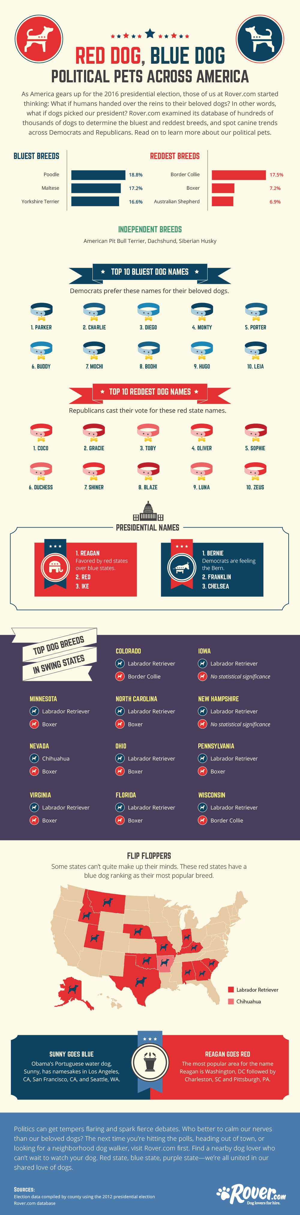
Rover: Dog breeds & names vs. political affiliation
This was a fun analysis I did as a contract job for the pet-sitting marketplace Rover. We combined their dog breed and name data with voting data from the 2012 presidential election to determine which breeds and names were more common among Democrats, Republicans, and Independents. They used my data to produce this infographic.
View the original report on the web, or a copy of the infographic here.
Excerpt:

Personal: Everett to Seattle Traffic Is Blowing Up
I collected detailed data on my commute to Seattle for three years, and wrote this report when I noticed a huge spike in the amount of time it was taking to get into the city.
Read the report right here on this site.
Sample visualization:

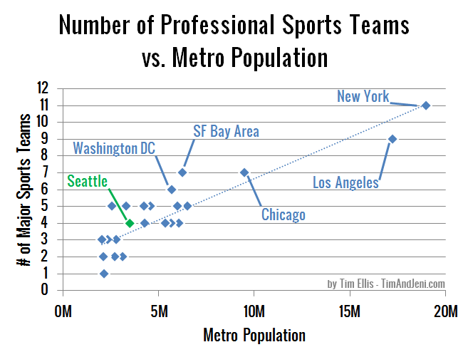
Personal: Can Seattle Support Six Major Pro Sports Teams?
After reading an article that suggested Seattle should get both a new NHL team and a new NBA team, I decided to do some analysis to compare how Seattle stacks up against other metro areas in terms of population vs. number of sports teams. I did this one in my free time, and it was picked up by a number of local news outlets.
Read the report right here on this site.
Sample visualization:
Personal: How Much Paint Would it Take to “Cover the Earth”?
Just for fun, I decided to run some numbers to figure out how much paint it would actually take to “cover the earth,” as depicted in the Sherwin-Williams logo. I created this visualization to share my findings.
Read the report right here on this site.
Sample visualization:
