Most microwaves that you find in the store have a user interface that is so terrible, I can only assume that it was designed by a committee of middle managers who don’t even know the meaning of the term “user interface.”
Allow me to explain. Here are a few examples of your typical microwave:
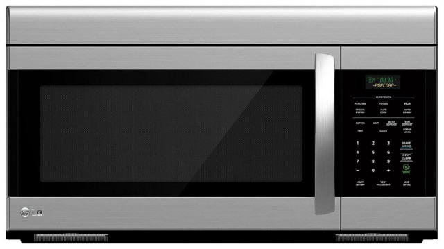
This LG microwave has 31 buttons. Thirty-one (non-tactile) buttons, when all I want to do with a microwave is heat up food for a specified amount of time..
Talk about overkill.
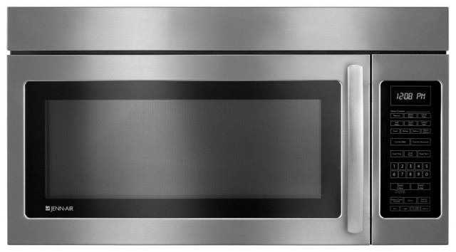
This Jenn-Air microwave sports 34 buttons. Thirty-four buttons! The microwave in my kitchen at home is a similar Jenn-Air model, also with thirty-four flat, zero-feedback buttons. The vast majority of the time, I use exactly two of these buttons: “Add 30 Sec.” (which also starts the heat) and “Stop / Cancel.” For those of you keeping score at home, that makes 94% of the buttons on my microwave a total waste of space.
Combine an excess of useless buttons with a completely flat surface that has zero tactile feedback, and you’ve basically designed the worst interface possible. Which comes standard on most microwaves. For some reason.
Let’s say I’m watching a movie in the next room over and would prefer not to divert my eyes from the screen and turn on the kitchen lights just to reheat my tea. Too bad. Thanks to the totally flat, non-tactile button style that has somehow become standard on microwaves, coupled with how tiny each button needs to be in order to fit that many buttons on the face of the microwave, hitting the correct buttons to heat your food or drink requires a well-lit room and your full attention.
Thankfully, microwave user interface design is not a completely lost cause… You won’t usually find them on the shelves of your local Sears or Target, but there are some microwaves that manage to avoid “death by mega-button-pad.”
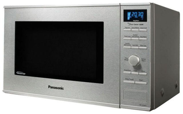
This is the microwave in the kitchen at my office, the awfully-named Panasonic “NN-SD681S Genius ‘Prestige'” ($180 on Amazon) It’s definitely a step in the right direction, with 14 raised tactile buttons plus a simple knob, but most of the buttons are still completely superfluous. What the heck is “Inverter Turbo Defrost” or “Inverter Melt & Soften”? No doubt some microwave engineer worked long hours coming up with these clever features, but seriously… why?
I don’t need my microwave to “sensor cook” my food. I don’t need it to tell me the time. I don’t need an entire button dedicated to “Pizza Slice” (I kid you not, that is a button on my microwave). I just need it to heat up food for a specified amount of time.
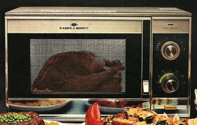
The really strange thing is that things have not always been this dire when it comes to microwave UI. Here’s a typical microwave from the 1970s:
That’s more like it. Two knobs and three nice, big, tactile buttons. It doesn’t get much more simple than that. Okay, well maybe it does…
I have been able to find one currently-available microwave that satisfies my simple use requirement of “heat up food for a specified amount of time” in the most elegant way possible. A microwave that sports a user interface that’s actually an improvement over microwaves of forty years ago, instead of a dozen giant steps backward.
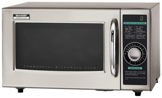
Behold the Sharp 1000W/R-21LC:
One knob. That’s the entire user interface. Zero buttons. Zero fancy-sounding features that never get used. Just turn the knob to the desired time, and the microwave heats the food. Lights blink around the knob to indicate how much time remains. So simple, so elegant. (Although I could do without all the superfluous text.)
I purchased this UI masterpiece at a surplus store, but I have also seen them at a “business” Costco in my area, or you can get it at Amazon for $280.
Unfortunately, it doesn’t come in an over-the-range style, so I won’t be able to replace the 34-button monstrosity in my kitchen just yet. For now I’ll have to be satisfied with only having a microwave that’s actually user friendly in the basement, but since that’s where I’m relocating my movie room to anyway, that will do nicely.
[2015 Update]
After this was posted on HackerNews and BoingBoing, some of the commenters on those sites brought up some info worth sharing.
First, a few people complained that I didn’t answer the “why” question in the headline. As it turns out, Reddit user colorimeter addressed that in a recent /r/AskEngineers thread (hat tip to BoingBoing commenter t3knomanser):
Guess what: US appliance controls are all contracted out, and there is very little institutional knowledge that is retained across the designs. … They are mostly pathetic designs, because nobody in the corporate side of this business seems to know what they are doing anymore. The poor sods who do this kind of work are probably some of the most disgruntled engineers out there, since they literally aren’t allowed to do a good job of it.
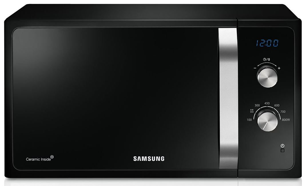
Also, HackerNews commenter ZeroGravitas pointed out another modern microwave with a clean, simple interface, the Samsung MS23F301EAK/EU:
[2020 Update]
The YouTube channel Technology Connections made a great video about a 1997 Sharp microwave that is pretty nifty. The button layout isn’t the best, but at least they are actual physical, buttons. And I will admit, the features of this microwave sound pretty darn useful. Give it a watch.
Max Mercer
I enjoyed your rant on microwave design. I’m currently a student taking a Human-Computer Interface course as a senior at Abilene Christian University, and I’ve developed quite a fondness for this subject. I am fascinated by good design, however, it seems to be a curse in itself as well, as I now am plagued with the awareness of how poorly-designed so many of our daily devices are. As I read your post, I felt like I could be writing this commentary myself. I just arrived on your page about 10 minutes ago and haven’t explored it yet, but I was wondering what you do for a career. I’m interested in possibly going into HCI if I can find a job. I was wondering if you had any suggestions as to how to get into that field. Anything would be appreciated!
Fahmi
Ah Im so glad this article exists was looking for examples of overdesign and immediately thought of modern microwaves with complex interfaces, I would have written a blog post on the same topic!
Boris
Wow, I am not the only man to like the knob! This fact gives me a bit of hope…
Boris
But really I’ve found another discussion of this type:
http://blog.codinghorror.com/a-lesson-in-control-simplicity/
Derek W
I agree that the UI on microwaves shouldn’t be that complicated. A knob is all that is needed. Regarding your ‘inverter’ , that is a feature that is unique to Panasonic, they have created a microwave emitter that can emit microwaves at different strengths. Other microwaves, when you put it on ‘defrost’ or whatever, what that means is it turns on the emitter at 100% still, but it cuts the power to the emitter for 70% of the time. The inverter tech in the Panasonic allows the emitter to remain active but at a low power level, so you can get softer butter or a better defrost. It is a better technology, and it’s not useless.
zen
Then just apply it automatically when defrost is used. What is the point of still having the lesser defrost ?
Nanopet
The thing is Derek…..I don’t care. And that’s just it. Most people don’t care.
Daniel Taylor
If it’s labelled with “inverter melt & soften” – and nobody knows what that means – then the technology is useless *no matter how brilliant it is*.
Good engineering is wasted if the UI is so bad that nobody ever uses it.
Alan
It’s certainly true that most microwaves have terrible user interfaces, but I don’t think this is unique to microwaves. Almost all consumer electronics today have terrible user interfaces.
Look at your TV’s remote control, your car’s in-dash “entertainment system”, or your house’s thermostat (unless you have a Nest). They’re all covered in 4000 buttons, often non-tactile, and arranged in no particular order. Lousy user interfaces are the norm.
We’re spoiled because smartphones generally have pretty good user interfaces, especially considering all the complexity they manage. But of all the electronics in our lives, it’s pretty much just cell phones that made the leap to good user interfaces.
Interestingly, if you want a microwave oven with a good user interface, the cheapest models tend to be the best. I bought a no-name $20 microwave once that has 2 knobs (time, power) and it’s the best I’ve ever used.
bayzid
I agree with this “It’s certainly true that most microwaves have terrible user interfaces, but I don’t think this is unique to microwaves. Almost all consumer electronics today have terrible user interfaces”
Paul Robichaux
I agree that the UI of most microwaves is indeed terrible, but your requirements are very limited. More complex use cases require more complex controls. For example, I often cook things that require the ability to control power output over time– say, 50% power for 5 minutes then 100% power for 3 minutes. In addition, I appreciate the convenience of being able to cook a baked potato or bag of popcorn with one button press.
Clearly there’s a market for the old-school, one-knob units, and equally clearly there’s a lot of room for improvement in UI design for models with more features. Keep up the fight! As Alan notes, our smartphones have spoiled us all for other devices.
Jamie
Sound is part of the user interface also. Everything beeps now, and it’s all similar, generic beeps that are not adjustable. Some microwaves are very loud, and why? What’s the emergency? I had one that was so loud, I think the sounder was reused from the backup alarm from a trash truck. I took it apart and taped foam over the sounder which reduced it to a mild stun setting.
Noble
My sister in Costa Rica took her microwave to get repaired. The shop just drilled a hole right through the panel of non-tactile buttons and installed a mechanical timer knob. Works great.
Henk Kleynhans
Hey Tim, I gave a talk at the Cape Town geek dinner on this very topic several years ago.
I originally thought that this was an “engineering overriding design” problem. That engineers were to blame because they’re coming up with features that customers don’t need and cram them in using buttons.
But a conversation with a friend working at BAT convinced me that the issue was more complex than that… He said that when the first microwaves with LCD displays and lots buttons came out, they were more expensive and sophisticated. Having a big, complex microwave oven in your kitchen meant that _you_ were also more ‘sophisticated’. Microwaves with buttons and displays sold better, at bigger margins, than microwaves with knobs.
I thought that marketers were to blame in this case for the terrible UX of microwave ovens, but I’m wondering how much bad design exists from people intentionally purchasing poorly designed products precisely because they’re poorly designed.
Dfg
The funny part is that is mostly concerns the US. In Europe, brands like Whirlpool (US company !) design very nice ovens with the basic 30-sec start button and simple power adjustment (+other fancy things).
I tried to find a whirlpool microwave when I moved to the US, but those were just as terrible as others. Finally bought the Panasonic with the button, but that one is disappointing too : you cannot increase /decrease the time once it started, nor change the power and the start button does not start/add 30 seconds.
Half-baked design, again.
TomK
The only necessary inputs are wattage and time (plus start and stop controls).
However, it’s convenient to have various wattage-and-time combinations assigned to labeled buttons (or menu items). It would be nice if one could dial in the wattage, dial in the time, then save that setting to a button and assign it a label (as we do when we set up an audio-video receiver.) Thus it would be possible to make “Beverage” mean the same thing (in terms of W+T) for any 2 microwaves.
randomthoughts
Honestly, I don’t care how complicated the interface is as long as the cooking results are there. I just bought a panasonic to replace an old broken panasonic and even though the (crappy) interface was the same, the new model could not do popcorn without burning it AND leaving a ton of unpopped corn. Had to return it.
The old panasonic was great at defrosting food on low wattage settings (non-inverter microwaves don’t use lower wattage they pulse… again, don’t care as long as the results are good). I didn’t even get to that point.
I do happen to prefer the new interface… really, a 30s/start cooking button is all you need for most tasks. It’s an RCA RMW1324
Michael
We have that HORRIBLE 34 button Jenn-Air microwave shown above and it is a daily nightmare. Besides all the real problems you correctly mentioned, those badly designed and confusing flat buttons do NOT light-up and the text is far too tiny and hard to read. I have to turn on all the lights in the kitchen each time I use this terrible thing. Plus, ours is about 4 years old and overpriced and the door-hinge has broken several times requiring expensive service calls.