
For most of this year I’ve been making the same Paleo breakfast every morning when I get to work. During that time, I’ve been asked some variation of “What are you making?” or “That smells delicious, what is it?” by roughly half of my coworkers. The short answer: It’s scrambled eggs with salmon and sun-dried tomatoes.
For those who want more details, and for the other half of my coworkers who would have asked me about my breakfast in the coming months, I decided to provide the following step-by-step breakdown.

Tim’s Paleo Breakfast Cost & Calories
First up, here’s a summary of the costs and calories in table format, because who doesn’t like tables.
| Item | Cost | Calories |
|---|---|---|
| eggs | $0.58 | 200 |
| salmon | $0.93 |
35 |
| tomatoes | $0.48 |
140 |
| Total | $1.99 |
375 |
Shopping List
Next, let’s take a look at what you’ll need to buy from the grocery store if you want to eat like me for some reason. I get all my ingredients for this Paleo breakfast from Costco, which is what I’m basing the prices on in the lists below. Okay, technically that last sentence was a lie since Redfin (my employer) provides the eggs as part of their regularly-stocked kitchen items, but I’m including the price of the eggs so other readers can get a complete picture of the total cost.
Here’s what I pick up at Costco:
- 24 Eggs (organic free-range): $6.99
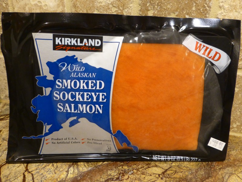
- Kirkland Signature Wild Alaskan Smoked Salmon, 16 oz:
$15.59$14.89 - Bella Sun Luci Sun-Dried Tomatoes, 2 lb:
$7.99$11.47$8.59
[October 2014 Update – A few months ago Costco stopped stocking Bella Sun Luci Sun-Dried Tomatoes, replacing them with Kirkland Signature Oven-Dried Roma Tomatoes. The new tomatoes come in the same size jar and cost around the same, but do not taste the same. In my opinion the taste and texture of Costco’s store brand dried tomatoes is inferior. I am now purchasing the Bella Sun Luci tomatoes directly from the manufacturer, who sells them for $50.67 + $18.13 shipping for a case of six, which comes out to $11.47 each. I have updated the prices above to reflect this change.]
[August 2015 Update – Good news, everyone! Costco dropped their terrible Kirkland Signature Oven-Dried Roma Tomatoes and brought back the Bella Sun Luci sun-dried tomatoes. They’re a little more expensive now than they were when I first put this post together, but the price of the salmon has gone down, so the overall cost is back down to just under two dollars. Nice. I never got a reply to the email I sent Costco corporate complaining about the inferior quality of their tomatoes, but I am going to take credit for this victory anyway.]
Ingredients
Next up, the daily portion size:
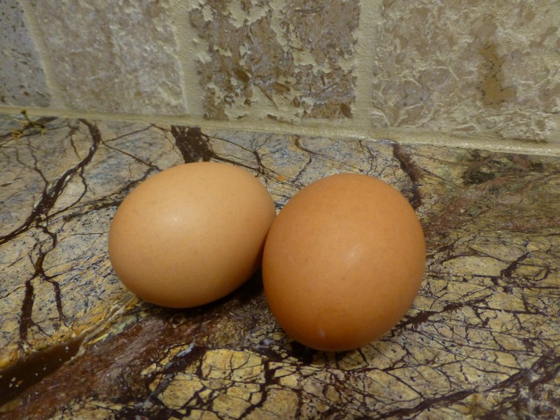
- 2 eggs
- 1 oz smoked salmon
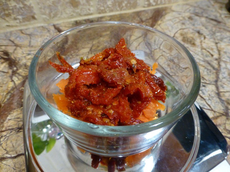
- 1⅓ oz sun-dried tomatoes
Technically that’s half a serving of salmon and two servings of sun-dried tomatoes. Obviously you should adjust the portions to your liking, but that’s what I happen to use. It’s also worth noting that I typically use a fork to get the tomatoes out of the jar, allowing as much oil as possible to drain off. This means that rather than the labeled 48 servings per 2-pound jar, I get about 36 servings per jar. In other words, about 25% of the contents of the jar of sun-dried tomatoes is olive oil.
Let’s Make Breakfast
If you’re making this at home the instructions are easy:
- stir everything together
- cook it on a greased skillet
Unfortunately something the Redfin kitchen doesn’t have is a burner, which means the skillet method isn’t available to me at work. Consequently, I’ve had to learn how to make the perfect scrambled eggs in the microwave. Here’s what the complete process—store to serve—looks like for me:
- buy salmon
- buy sun-dried tomatoes
- buy eggs
- prep salmon (night before)
- prep tomatoes (night before)
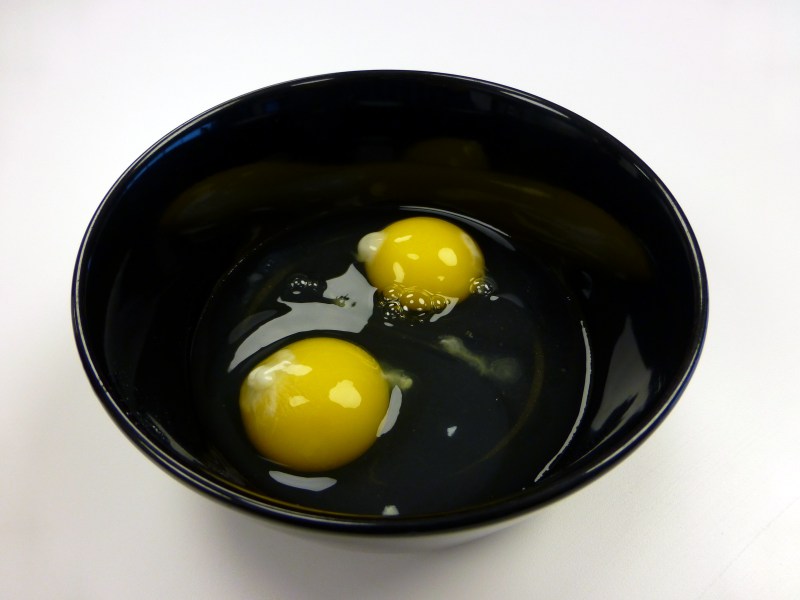
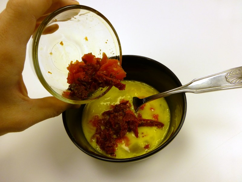
- break 2 eggs into a bowl
- beat the eggs
- add the salmon & tomatoes
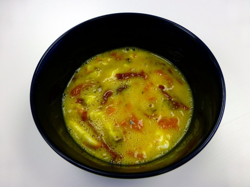
- stir ingredients together
- microwave 1 minute at 50% power
- remove from microwave
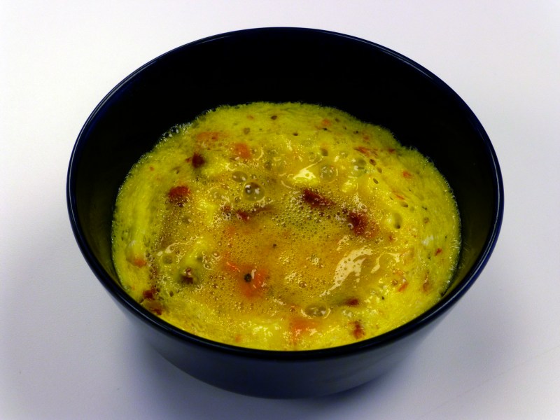
- stir ingredients together
- microwave 1 minute at 50% power
- remove from microwave
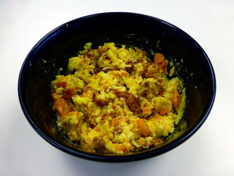
- stir ingredients together
- microwave 10-30 seconds at 50% power, depending on how wet you like your eggs
- remove from microwave
- enjoy
And here it is in pictures, if you’re more of a visual person (click for slideshow):


That’s it! Add some salt & pepper or your favorite hot sauce (I prefer Frank’s Red Hot) and you’ve got yourself a healthy, delicious, energy-packed breakfast.
P.S. – If you’re wondering what “Paleo” is, in short it’s a way of eating that consists primarily of meat and vegetables. Basically you eat no sugars, no processed foods, and no grains. I’ve been eating this way (though not 100% strict) for most of 2013. I don’t care about nor buy into Paleo’s evolutionary mumbo-jumbo backstory. All I know is that eating this way helps me feel great and have more energy throughout the day. Plus I shaved about 15 pounds in the first month, so that was a nice bonus.


 After 3,723 hours of service, the lamp in my projector literally exploded one Friday night (01/25) a few weeks ago in the middle of 30 Rock (okay, technically I think it actually imploded). With just over a week left before my annual Groundhog Day party (02/02), I needed to order a new lamp right away, so I got online immediately and began the hunt.