I logged every cup of tea I drank in 2016

For no particular reason, I decided to keep a detailed log of every cup of tea I drank in 2016. I kept track of the time I started drinking each cup, what time I finished the cup, the brand and flavor of tea, the type of vessel I was drinking from, and a few other things. Now that 2016 is finally over, it’s time to share the results. Note that here I am referring only to hot tea. I don’t tend to drink iced tea.

Tim’s 2016 Tea Stats

  • Total hot tea consumed: 7,086 fl. oz.
  • Number of individual mugs: 790
  • Average duration per 8oz.: 1 hour 50 minutes
  • Median duration per 8oz.: 1 hour 37 minutes
  • Favorite brand/blend: MarketSpice Cinnamon-Orange (3,514 fl. oz.)
  • Top hour for tea: 9AM-10AM

I don’t drink coffee, so I tend to drink a lot of strong black tea in the mornings. Meanwhile, the early afternoon is a good time for green tea, as evidenced by the tea type by hour chart:

Tim's 2016 Tea Consumption by Hour

The majority of the tea that I drank in 2016 was from MarketSpice, a local tea company here in Seattle. In a distant second was Tazo, the brand of tea stocked in the office at work.

Tim's 2016 Tea Consumption by Brand

Most of the tea that I drink is black tea. I should probably try to shift the balance more toward green tea, given its numerous health benefits.

Tim's 2016 Tea Consumption by Type

Most of the time when I’m drinking tea I’m sitting (or standing) at my desk, working. At both my workplace office and my home office I’ve got an electric mug warmer that keeps the tea at a pleasing temperature for the entire duration of each cup.

Tim's 2016 Tea Consumption by Vessel

When I’m drinking tea away from home, it’s almost always in my Zojirushi insulated mug, which keeps the tea hot literally all day. Even though I took a lot longer to drink tea when I was away from home, it was always still hot when I finished it.

Tim's 2016 Tea Drink Duration by Vessel

I was also curious whether there’s any sort of seasonal trend to my tea consumption. The answer to that question appears to be “not really, but there was a bit of a drop-off in November and December.”

Tim's 2016 Tea Consumption by Month

Finally, I thought it would be interesting to compare my 2016 tea consumption to data on tea consumption around the world. The best data I could find on this was from a 2014 Quartz story. The catch is that the annual per capita consumption by country data was measured in weight of tea leaves rather than volume of tea drink.

In order to properly compare my 2016 tea consumption to the rest of the world, I counted up the number of cups I drank using tea bags and multiplied it by the average weight of tea contained in a typical tea bag, 0.075 ounces. I also weighed the leaves I typically use to brew an eight ounce cup of loose leaf tea, which was about 0.4 ounces for MarketSpice Cinnamon-Orange. I told you that I like my tea strong.

The total estimated weight of the tea leaves used to prepare all the tea I drank in 2016 came out to 13.5 pounds, nearly double the per capita consumption in Turkey, the heaviest tea-drinking country in the world, and over 27 times as much tea as the per capita consumption here in the United States.

Tim's 2016 Tea Consumption vs. The World

In conclusion: I like hot tea.

Forget Red Light Cameras, We Need Yellow Light Lines

Red light cameras are sold by the companies that install them and the cities that use them as a “safety” feature. Whether or not they actually improve safety is up for debate, but there is no doubt that they are big money makers for the cities that use them. If cities were primarily concerned with safety instead of generating revenue they would get rid of red light cameras and replace them with a yellow light line.

A Yellow Light Line?

tl;dr – Paint a yellow line on the road. If you’re traveling the speed limit as you approach an intersection and you’ve passed the yellow line when the light turns yellow, just keep going and you’ll clear the intersection before the light turns red. If you’re behind the yellow line, hit the brakes because the light will turn red before you clear the intersection.

How it Works

Actually there isn’t much more to it than that. Here’s what a city would need to do to implement yellow light lines:

  1. use the speed limit and the length time the traffic light stays yellow to calculate distance
  2. paint the yellow light line on the street at the distance calculated in step 1
  3. there is no step 3

Simple, effective, and cheap.

Why It’s Needed

Intersections controlled by traffic signals have a basic design flaw that red light cameras only serve to exacerbate. Drivers are unsure of how long they have to clear the intersection once the light turns yellow. Should you slow down or speed up? Every intersection has different timing, and when an intersection is equipped with a red light camera that doles out $124 tickets, drivers are much more likely to slam on the brakes even if they could make it through safely. This leads to more rear-end collisions.

With yellow light lines, that ambiguity is completely eliminated with a simple, clear visual. If you’ve passed the line when the light turns yellow, continue on at the speed limit and you will safely clear the intersection before the light turns red. If the line is in front of you, you’ll need to stop. No more uncertainty, no more slamming on the brakes.

Yellow Light Line Calculator

In order to help visualize this concept I’ve created this handy calculator. Simply edit the speed limit and/or the yellow light length to see how far from the intersection the yellow light line would be painted.

Addressing Objections

This section has been added to address some of the objections brought up by Redditors at /r/Seattle.

It’s not illegal to be in the intersection when the light turns red, it’s illegal to enter the intersection after the light turns red. – davethegr8

Indeed, the relevant law here in Washington State (RCW 46.61.055) indicates that it is only illegal to enter the intersection on a red light. However, since the purpose of the yellow light line is not to adhere to strict legal definitions but rather to improve safety, I think it would be best to measure the distance from the end of the intersection rather than the entrance.

How about telling people what you did so they know what the lines are? – Sir_Dude

This is a good point. Above I jokingly said “there is no step 3,” but in reality step 3 would be driver education.

Oh, and how are these lines going to work with heavier vehicles? An SUV is going to need more room to stop than a Prius. One line isn’t going to work for all cars. – Sir_Dude

The yellow light line is not placed based on how long it will take you to stop. The line is placed based on where you can clear the intersection while traveling at the speed limit.

Example: A driver in a Prius is driving the limit on a 35mph road and the light stays yellow for three seconds. They will travel 154 feet during the three seconds that the light is yellow. A driver in a big rig, will still travel the same 154 feet if they are driving 35mph for three seconds. So we paint the yellow light line 154 feet from the end of the intersection.

If three seconds is not enough time for a big rig to stop, then the length of time the light is yellow should be adjusted by the city. This obviously would move the location of the yellow light line, but the correct location of the line is not variable for different vehicles, it depends only on the speed limit and the length of time the light is yellow.

Currently, judgement is all drivers depend on. If you suddenly give drivers a “tip” for determining if they should go or stop, what will change? People tend to be aware of their current speed, their braking capability based on vehicle characteristics, and how far they have before the stop line. – steve_mcgee

It is true that drivers are (or should be) aware of those things. However, what drivers are often unaware of is how long the light will stay yellow, and whether or not that is enough time to make it through the intersection from their location when it turns yellow. This issue is exacerbated by the fact that different intersections have different yellow light timing. The yellow light line is a simple way of providing exactly that piece of information to drivers.

Light timing changes (gets shorter) on many intersections late at night. The timing would be off on clearing the intersection or you’d need two lines. – eran76

The overall cycle of a given traffic signal may get shorter at night, but the length of time the light is yellow is constant regardless of how long the light stays red or green, and does not change throughout the day.

What’s Next?

Like this idea? Contact your local city council and point them to this post. Share it on your favorite social media site and spread the word. Or if you’re really ambitious, file a statewide citizen’s initiative. If you feel like living dangerously, you can run the calculator for the intersections in your neighborhood, grab some yellow paint, and engage in some “Guerrilla Public Service” like L.A. artist Richard Ankrom, who installed his own freeway sign in 2001.

I’ve also provided a handy embed code above so you can easily share the yellow light line calculator.

Or maybe you think I’m a clueless idiot and this is an incredibly stupid idea? Point out the flaws in my logic in the comments below.

As always, thanks for reading.

Yellow Light Line Example

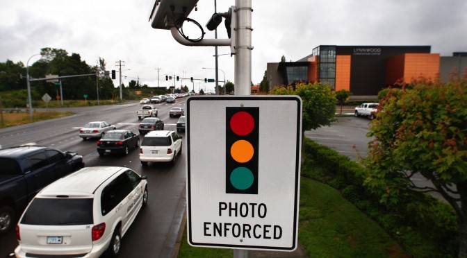
Featured photo by Dan Bates, Everett Herald

Everett to Seattle Traffic Is Blowing Up

Has Seattle traffic suddenly gotten a lot worse, or is it just my skewed perception? I take the Sound Transit 510 express bus from Everett to Seattle every day for work and in the past few weeks I’ve experienced some really excruciating commutes, particularly in the morning on the way into Seattle.

Seattle’s worsening traffic has been the subject of a number of recent articles in both the Seattle Times1 and the Everett Herald2 based on a recent Corridor Capacity Report published by the Washington State DOT. However, this report only covers data through 2013, and my impression has been that things have gotten considerably worse just in the last few weeks.

As it turns out, I just so happen to have been collecting detailed data about my commute for over three years. Since late 2011 I’ve been logging the time at fourteen points along my way to work in the morning and on the way home in the evening. Using this data set, I can visualize my commutes to see if the last few weeks have seen anything truly out of the ordinary.

The plot below has a blue dot indicating the time between boarding the bus in Everett (at 34th & Broadway or 38th & Broadway) every morning and disembarking on one of the first stops (Stewart Street) in downtown Seattle. Orange dots represent the time spent on the bus in the evenings going the reverse direction. The lines are a 30-day rolling average.

Everett to Seattle Express Bus Rides

After peaking at 56 minutes in late 2012, then peaking at 54 minutes in late 2013, the 30-day average morning commute has risen to an hour and five minutes as of November 3rd.

In fact, six of the ten worst morning commutes I’ve experienced in the last three years have been in just the past three weeks.

Top Ten Worst 510 Express AM Rides
Date AM Ride
2014-10-20 01:49
2014-10-28 01:47
2014-11-04 01:46
2014-09-24 01:44
2013-11-08 01:40
2012-11-19 01:35
2014-10-23 01:33
2014-10-21 01:33
2012-05-31 01:33
2012-11-01 01:33

Probably due to the combination of the onset of rainy weather, less daylight, and other factors, the fourth quarter of each of the last three years has seen considerably worse morning traffic than the rest of the year, but this so far year it has been absolutely dreadful.

Median Everett to Seattle Morning Commute by Quarter

Interestingly, evening traffic in the opposite direction over this same period has not seen any significant increase compared to last year.

Median Everett to Seattle Evening Commute by Quarter

Hopefully the last few weeks have just been a series of terrible flukes, rather than the beginning of a trend of consistently nightmarish morning commutes.

At least I always get a seat on the bus, where I can sleep, read Reddit, or write blog posts like this.

How Much Paint Would it Take to "Cover the Earth"?

If you’ve done any painting lately, you’ve probably encountered the Sherwin Williams logo:

Sherwin Williams - "Cover the Earth"

The visual of a can of paint larger than the moon being poured over Earth has always been something of a curiosity to me. Setting aside the obvious environmental concerns (to put it lightly) of literally covering the planet in paint, I can’t help but wonder when I see that image: How much paint would it really take to “Cover the Earth”?

A similar question was tackled by the venerable Randall Munroe in a February entry of his “What If?” series, but the question he was addressing was slightly different (“Has humanity produced enough paint to cover the entire land area of the Earth?”). I want to know how much paint it would take to literally pour out a can and have it completely cover the planet—land, water, and all.

Let’s figure out just how big that giant planet-destroying Sherwin Williams paint can would really need to be in order to “Cover the Earth” with one coat of paint.

We’ll start with the surface area of Earth, which comes in at 196.9 million square miles.

Surface Area of Earth

Although the logo shows the planet-painting in progress rather than complete, we’re going to assume given the amount of coverage shown, the large splash at the top, and the fact that the can is tipped almost completely over that there was enough paint in the can to cover the entire planet once over with a standard coat of exterior paint.

For this project we’ve selected Sherwin Williams Resilience™ Exterior Acrylic Latex Paint. Here’s the product description:

Don’t let weather worries ruin your painting schedule. Resilience® Exterior Acrylic Latex paint gives painted exteriors exceptional moisture resistance so you don’t have to postpone painting when the forecast calls for rain, or quit working early in the day because you’re concerned about dew. You can apply Resilience in temperatures as low as 35°F.

Sounds perfect. Plus, the base color is Red, just like the logo. According to the technical data sheet, Resilience paint covers 350 to 400 square feet per gallon. We’ll go with the midpoint of that range and assume that a gallon of paint covers 375 square feet of Earth on average.

Now it’s time for a bit of math. One mile is 5,280 square feet, so a square mile is 5,280 feet * 5,280 feet = 27,878,400 square feet. Multiply the 196.9 million square mile surface area of Earth by 27.9 million and we get 5.5 quadrillion square feet. Divide that by our 375 square feet per gallon coverage and we come to 14.6 trillion gallons of paint to cover the planet in one coat of Sherwin Williams Resilience™ Exterior Acrylic Latex Paint.

So how big would that giant SWP paint can need to be in order to hold 14.6 trillion gallons? A standard 1-gallon paint can measures 6⅝” diameter by 7½” height, occupying total volume of 1.12 gallons. If we assume that our mega-can would be the same shape, just scaled up, we’ll end up with a can of paint that has a diameter of 2.6 miles and is 5.8 miles tall.

Here’s a visualization of our Earth-covering can of paint in comparison to some recognizable landmarks:

"Cover the Earth" Paint Can Visualization

That’s a pretty big paint can, but it’s actually a lot smaller than the moon, which has a diameter of 2,159 miles. Note the surface of the moon in the visualization, to give you a sense of scale.

Sherwin Williams Moon-Sized Paint Can

So, what if we actually had a can of paint with as much volume as the moon, as shown in the logo?

The volume of the moon is 2.1958×10¹⁰ km³, or roughly 5.8×10²¹ gallons, which is 397,260,274 times as much volume as our Earth-covering paint can. Let’s round that up slightly to a nice even 400 million coats of paint.

At 375 square feet per gallon, each coat of paint would be 0.00428 inches thick. It’s probably a little thinner when it dries, but with as much as we’re going do dump out on the planet, I don’t think that will happen for quite a while.

If you poured this moon-sized can of paint over Earth, the entire planet would be covered in about 27 miles of Sherwin Williams Resilience™ Exterior Acrylic Latex Paint. (Actually it wouldn’t go quite that deep, since the deeper it gets the bigger the surface area we’re covering with each layer.)

I’m no painting expert, but I think that would be going a little overboard.

Note: The coverage of a moon-sized paint can calculated at the end has been corrected. Thanks to the /r/theydidthemath user who pointed out my error.

Which is More Dangerous: Climbing Rainier or the “Deadliest Job”?

With the news a few weeks ago of the death of six climbers on Mount Rainier, I found myself wondering… just how dangerous is climbing Rainier, anyway? Is it really more dangerous than other risky activities that we do every day?

For example, thirty thousand people in the United States die every year in automobile accidents, but since we don’t see front page headlines about every single fatal collision, perhaps we just perceive the risk to be lower than climbing a mountain. Maybe mountain climbing is just as dangerous as your daily commute, but your perception is skewed.

In order to answer my question, I collected fatality rate data on a variety of activities to compare with climbing Rainier. Here are the risky activity contestants, and the average annual number of fatalities that occurred during each over the last ten years or so.

  • walking: ~4,000 fatalities
  • bicycling: ~600 fatalities
  • driving a car: ~30,000 fatalities
  • driving a motorcycle: ~4,000 fatalities
  • commercial flight: ~14 fatalities
  • skydiving: ~22 fatalities
  • Dungeness crab fishing: ~3 fatalities
  • climbing Mount Rainier: ~1 fatality

I wanted to include a good variety of activities, from things we all do every day like walking, riding a bicycle, or driving, to things that most of us probably don’t do, but are widely considered to be dangerous, like skydiving and professional Dungeness crab fishing, an activity that is widely regarded as the “deadliest” occupation in the country.

To compare everything on a relatively level playing field, I divided the total number of deaths over the last ten-ish years in each activity by the total number of trips taken in that activity in the same period, then multiplied by 100 million to bring all the numbers up to a scale that’s easier to visually compare.

Here’s the result:

Fatality Rate of Various Activities (deaths per 100 million trips)

Okay then! As it turns out, mountain climbing is ridiculously more dangerous than every other activity I was able to find data on. It’s not even remotely in the same league. Climbing Mount Rainier is 14 times more deadly than the “deadliest job” of fishing for crab in Alaska.

Now, it’s worth noting that normalizing for deaths per 100 million trips isn’t totally fair, since most people who attempt to summit Rainier will probably only do it once or twice in their lives, while the average person probably takes 50 to 100 thousand trips in a car through the course of their lifetime. Your odds of dying in a car wreck on any given trip are fairly low, but the odds that you might die in a car wreck sometime in your lifetime are much higher.

To quantify that, the odds that you’ll die in an attempt to summit Rainier are roughly 0.02 percent. The odds that you’ll die on any given trip in your car is 0.0000038 percent. But the odds that you’ll die in a car wreck sometime in your life is roughly between 0.19 percent and 0.38 percent—considerably higher than your odds of dying in a single attempt to summit Rainier. In other words, your chances of dying from driving at some point in your life are about 19 times greater than your chances of dying while climbing Rainier.

Still, I was surprised that climbing Rainier is that dangerous per trip. A 0.02 percent fatality rate sounds low, but it’s way, way higher than every other activity on the list. Of course, it’s not even remotely the most dangerous thing you can do. If I had included a bar for climbing Mount Everest, it would have made everything else on the chart look minuscule. Everest has around a one percent fatality rate—1,000,000 deaths per 100 million trips compared to “just” 15,942 for Rainier. And according to Mental Floss, there are at least five mountains even more dangerous than Everest—including Annapurna in Central Nepal, with a 22 percent death rate (22,000,000 deaths per 100 million trips).

So basically I won’t be climbing any mountains. Ever.

Feature photo by Flickr user Keith